React的CSS-in-JS方案:styled-components
您好,我是沧沧凉凉,是一名前端开发者,目前在掘金、知乎以及个人博客上同步发表一些学习前端时遇到的趣事和知识,欢迎关注。
这是我学习React后的总结文章之一,通过React的学习,我打开了一个前端新世界。本篇文章要推荐的也是我在项目中使用的一个开源库:styled-components。
该库可以让你使用ES6语法创建样式组件,同时可以很方便的向组件中传入不同的属性来改变组件样式,它和React提供的style-in-js不同的是它使用的是CSS的语法,甚至可以使用Less和Sass的一些语法,让前端开发者可以以较小的学习成本就可以创建出高复用性的样式组件。
1. 简单使用
styled-components的用法非常的简单,只需要声明一个styled-components然后就和使用div一样的使用该组件就可以了:
import styled from "styled-components";
// 声明一个styled-components组件const Button = styled.button<{ primary?: boolean }>` background: ${(props) => (props.primary ? "palevioletred" : "white")}; color: ${(props) => (props.primary ? "white" : "palevioletred")};
font-size: 1em; margin: 1em; padding: 0.25em 1em; border: 2px solid palevioletred; border-radius: 3px;`;
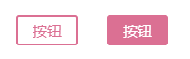
export default function App() { return ( <> <Button>按钮</Button> <Button primary>按钮</Button> </> );}值得注意的是styled-components创建的组件首字母必须以大写开头。
上面的代码渲染结果:
几乎所有基础的HTML标签styled都支持,比如div,h1,span…
styled.xxx后面的.xxx代表的是最终解析后的标签,如果是styled.a那么解析出来就是a标签,styled.div解析出来就是div标签。
2. 延伸
有些时候我们只需要在已有的组件上面进行一点点的样式变更同时要保留原有的属性,比如Antd提供的组件,这个时候就可以直接使用styled():
import styled from "styled-components";
const Button = styled.button` color: palevioletred; font-size: 1em; margin: 1em; padding: 0.25em 1em; border: 2px solid palevioletred; border-radius: 3px;`;
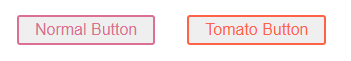
// 延伸Button的样式const TomatoButton = styled(Button)` color: tomato; border-color: tomato;`;
export default function App() { return ( <> <Button>Normal Button</Button> <TomatoButton>Tomato Button</TomatoButton> </> );}最终的渲染如下图所示:
这个功能在二次封装组件的时候使用的非常多。
3. 条件渲染
styled-components最核心的一点,我个人认为也是这一点,让styled-components变得如此火热,我们直接先看下代码:
字符串前面那个css可加可不加,不加也是能够正常进行渲染的,但是还是推荐加,如果你不加的话在编辑器中就会失去提示的功能,编辑器会把它当作字符串而不是CSS样式。
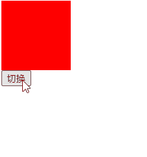
import { useState } from "react";import styled, { css } from "styled-components";
const Box = styled.div<{ small?: boolean }>` ${(props) => props?.small ? css` width: 100px; height: 100px; ` : css` width: 200px; height: 200px; `}
background-color: red;`;
export default function App() { const [small, setSmall] = useState(true);
return ( <> <Box small={small} /> <button onClick={() => setSmall(!small)}>切换</button> </> );}渲染如下:
可以看到,使用styled-components编写组件样式的过程会变得异常的简单,如果你用的是CSS,那么你是无法通过React的Props进行更改CSS中的属性,你只能通过Props动态更改dom上绑定的类名,就如同下面的代码一样。
import { useState } from "react";import "./styles.css";
export default function App() { const [small, setSmall] = useState(true);
return ( <> <div className={small ? "box-small" : "box"} /> <button onClick={() => setSmall(!small)}>切换</button> </> );}这样看起来styled-components没有什么特别的,甚至上面的写法还比较麻烦?其实styled-components的威力不止于此,我们看一下下面的例子:
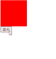
import { useState } from "react";import styled, { css } from "styled-components";
const Box = styled.div<{ size?: number }>` ${(props) => css` width: ${props?.size}px; height: ${props?.size}px; `} background-color: red;`;
export default function App() { const [size, setSize] = useState(100);
return ( <> <Box size={size} /> <button onClick={() => setSize(size + 2)}>变大</button> </> );}渲染如下:
如果是通过CSS属性就非常难以实现这种效果,只有靠React官方提供的style-in-js方案,直接编写行内属性:
import { useState } from "react";
export default function App() { const [size, setSize] = useState(100);
return ( <> <div style={{ width: size, height: size, backgroundColor: "red" }} /> <button onClick={() => setSize(size + 2)}>变大</button> </> );}4. 普通样式
如果使用过Vue的同学应该很清楚,在.vue文件中有个style标签,你只需要加上了scoped就可以进行样式隔离,而styled-components其实完全具有Vue的style标签的能力,你只需要在最外面包一层,然后就可以实现Vue中样式隔离的效果。
import styled from "styled-components";
const AppStyle = styled.div` .box { width: 100px; height: 100px; background-color: red; }`;
export default function App() { return ( <AppStyle> <div className="box" /> </AppStyle> );}渲染结果:

甚至还可以配合上面的条件渲染进行使用,也非常的方便:
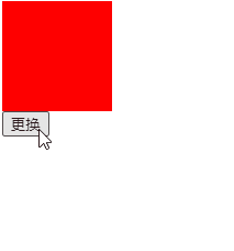
import { useState } from "react";import styled, { css } from "styled-components";
const AppStyle = styled.div<{ change: boolean }>` ${({ change }) => change ? css` .box { width: 200px; height: 200px; background-color: blue; } ` : css` .box { width: 100px; height: 100px; background-color: red; } `}`;
export default function App() { const [change, setChange] = useState(false);
return ( <AppStyle change={change}> <div className="box" /> <button onClick={() => { setChange(true); }} > 更换 </button> </AppStyle> );}渲染效果如下图所示:
5. attrs
在一些HTML标签中,是有一些属性的,比如input标签中,有type这个属性,我们就可以使用attrs给上一个默认值,还可以实现不传对应的属性则给一个默认值,如果传入对应的属性则使用传入的那个属性值。
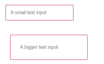
import styled from "styled-components";
const Input = styled.input.attrs((props) => ({ // 直接指定一个值 type: "text",
// 给定一个默认值,可以传入Props进行修改 size: props.size || "1em"}))` color: palevioletred; font-size: 1em; border: 2px solid palevioletred; border-radius: 3px;
margin: ${(props) => props.size}; padding: ${(props) => props.size};`;
export default function App() { return ( <div> <Input placeholder="A small text input" /> <br /> <Input placeholder="A bigger text input" size="2em" /> </div> );}渲染效果:
如果有延伸的话,接收是延伸后的属性:
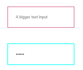
const Input = styled.input.attrs((props) => ({ type: "text", size: props.size || "1em"}))` border: 2px solid palevioletred; margin: ${(props) => props.size}; padding: ${(props) => props.size};`;
// 有延伸的话,以延伸后的组件中的属性为准const PasswordInput = styled(Input).attrs({ type: "password"})` border: 2px solid aqua;`;
export default function App() { return ( <div> <Input placeholder="A bigger text input" size="2em" /> <br /> <PasswordInput placeholder="A bigger password input" size="2em" /> </div> );}最后渲染结果:
6. 动画
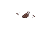
动画需要使用keyframes进行声明,如下所示:
import styled, { keyframes } from "styled-components";
// 通过keyframes创建动画const rotate = keyframes` from { transform: rotate(0deg); }
to { transform: rotate(360deg); }`;
// 创建动画的组件const Rotate = styled.span` display: inline-block; animation: ${rotate} 2s linear infinite; padding: 2rem 1rem; font-size: 1.2rem;`;
export default function App() { return ( <> <Rotate>< 💅🏾 ></Rotate> </> );}渲染结果:
7. 性能问题
不要将styled-components组件放到render函数中进行声明!
比如下面这种情况,一旦你放入render中进行声明,那么每次组件刷新的时候这个样式组件会反复创建,带来性能问题。
import { useState } from "react";import styled, { css } from "styled-components";
export default function App() { const [size, setSize] = useState(100);
// 在Render中进行声明styled-components组件,会造成性能问题 const Box = styled.div<{ size?: number }>` ${(props) => css` width: ${props?.size}px; height: ${props?.size}px; `} background-color: red; `;
return ( <> <Box size={size} /> <button onClick={() => setSize(size + 2)}>变大</button> </> );}8. 配合TypeScript
React+TypeScript一直是神组合,React可以完美的搭配TypeScript。
但在TypeScript中使用得先安装@types/styled-components类型声明库:
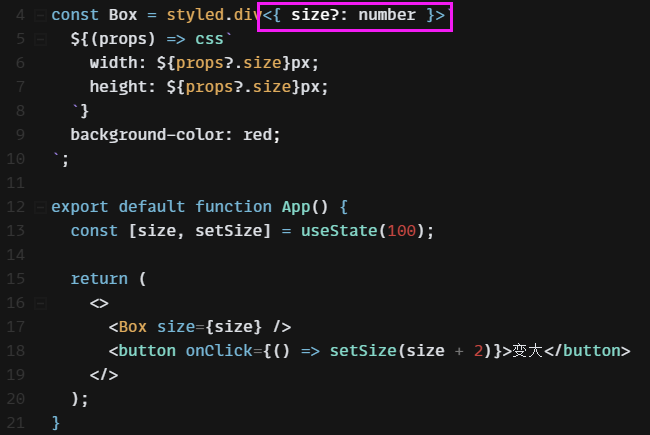
如在是要在TypeScript中,那么需要对styled-components组件的属性类型进行声明,不然会报错,虽然不会影响最终的编译结果:
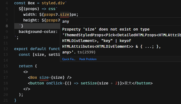
下面的组件类型就需要进行声明:
9. 最后
styled-components的用法远远不止这些,还有一些更加高级的用法,不过这些留到下一篇文章中我再进行总结,本篇文章中总结的一般都是我在项目中经常会使用到的一些语法。
用styled-components写一些复用组件非常方便,可以让组件实现非常多自定义样式。
☕ 请我喝杯咖啡
如果这篇文章对你有帮助,欢迎打赏支持!