用CSS实现渐变边框,实现过程很简单最终效果却很赞
约 3 分钟阅读
CSS
CSS
一个看起来很酷的网站,CSS肯定是头号功臣,但平时由于开发技术、周期上的限制,大部分时间都是使用现成的UI框架进行开发,这就会造成好像开发出来的网页都一个模样,就跟使用WordPress搭建出来的网站一样,看起来貌似都一个样。
今天给大家分享的就是如何使用CSS开发一个渐变的盒子边框。
最终效果如下:
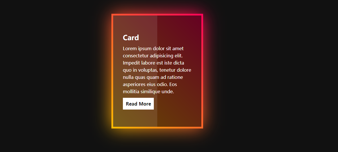
看上去是不是很炫酷,但是CSS代码却不复杂,其中伪元素起到了很重要的作用。
1. 代码
因为源代码并不复杂,所以这里直接贴上源代码,我在重点的地方都做了注释:
<!DOCTYPE html><html lang="zh"> <head> <meta charset="UTF-8" /> <meta http-equiv="X-UA-Compatible" content="IE=edge" /> <meta name="viewport" content="width=device-width, initial-scale=1.0" /> <title>渐变边框</title> <style> * { margin: 0; padding: 0; box-sizing: border-box; }
body { display: flex; justify-content: center; align-items: center; background-color: #111; }
.container { position: relative; display: flex; justify-content: center; align-items: center; padding: 40px 0; flex-wrap: wrap; }
.container .box { position: relative; width: 320px; height: 400px; color: #fff; background-color: #111; display: flex; justify-content: center; align-items: center; margin: 20px 30px; transition: 0.5s; }
.container .box:hover { transform: translateY(-20px); }
/* 通过两个伪类来实现渐变 */ /* 这里是为了实现渐变边框 */ .container .box::after { content: ""; position: absolute; top: 0; left: 0; width: 100%; height: 100%; background: linear-gradient(45deg, #ffbc00, #ff0058); }
/* 这里是为了实现渐变边框虚化 */ .container .box::before { content: ""; position: absolute; top: 0; left: 0; width: 100%; height: 100%; background: linear-gradient(45deg, #ffbc00, #ff0058); filter: blur(30px); }
.container .box span { position: absolute; top: 6px; left: 6px; right: 6px; bottom: 6px; background-color: rgba(0, 0, 0, 0.6); z-index: 2; }
/* 使左右两边颜色有一定差距 */ .container .box span::before { content: ""; position: absolute; top: 0; left: 0; width: 50%; height: 100%; background-color: rgba(255, 255, 255, 0.1); }
.container .box .content { position: relative; z-index: 10; padding: 20px 40px; }
.container .box .content h2, .container .box .content p { color: #fff; margin-bottom: 10px; }
.container .box .content p { line-height: 25px; }
.container .box .content a { display: inline-block; color: #111; background-color: #fff; padding: 10px; text-decoration: none; font-weight: 700; } </style> </head> <body> <div class="container"> <div class="box"> <span></span> <div class="content"> <h2>Card</h2> <p> Lorem ipsum dolor sit amet consectetur adipisicing elit. Impedit labore est iste dicta quo in voluptas, tenetur dolore nulla quas quam ad ratione asperiores eius odio. Eos mollitia similique unde. </p> <a href="#">Read More</a> </div> </div> </div> </body></html>2. 样式复用
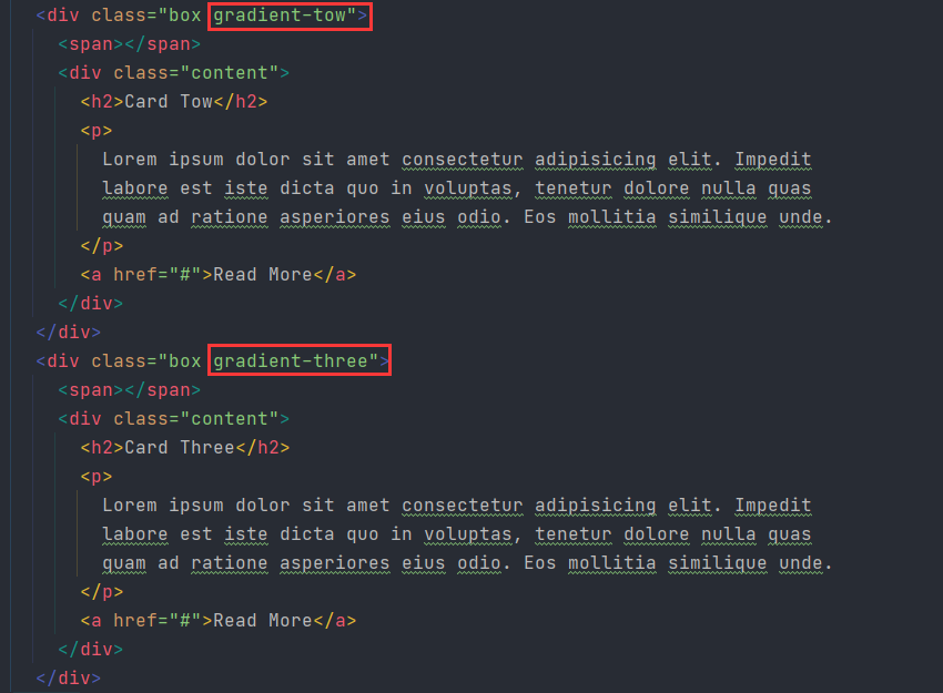
因为考虑到这种渐变边框的CSS样式有一定复用性,所以我们可以使用SASS将它们提取成一个可以通用的mixin。
// 设置渐变边框@mixin gradient-border($args) { content: ""; position: absolute; top: 0; left: 0; width: 100%; height: 100%; background: $args;}
// 给盒子赋予渐变边框@mixin gradient-box($args) { position: relative;
&::after, &::before { @include gradient-border($args) }
&::before { filter: blur(30px); }}
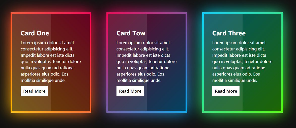
.gradient-one { @include gradient-box(linear-gradient(45deg, #ffbc00, #ff0058))}
.gradient-tow { @include gradient-box(linear-gradient(315deg, #03a9f4, #ff0058))}
.gradient-three { @include gradient-box(linear-gradient(315deg, #4dff03, #00d0ff))}只需要预先定义一些类,在需要的盒子上面添加上这些类就可以实现渐变边框的效果:
最终效果:
3. 最后
一般来说,越酷炫的东西在外行人眼中感觉就越复杂,即使实现原理非常简单。有些复杂的东西却比较千篇一律,在外行人眼中就觉得实现起来很简单,别人网站不都可以实现嘛,你为什么实现不了,所以平时没事的时候我就喜欢积累一些骚操作。
参考视频:Creative CSS Gradient Border Cards | How to Create CSS Gradient Border
☕ 请我喝杯咖啡
如果这篇文章对你有帮助,欢迎打赏支持!